
You might recognize Minecraft at a glimpse today, but do you know what the original Minecraft logo was or how the symbol began and evolved?
Minecraft is one of the most popular games in the world, which has been earning 140 million active players since its original release in 2011. What started as a simple sandbox game became a deeply engaging world for gaming enthusiasts. It has been constantly updating and evolving over the years.
In this blog, we are going to take an in-depth look at the history and evolution of the Minecraft logo and how the image has evolved to suit a modern audience.
Understanding The Meaning Of Minecraft Symbols
When it comes to hidden depth, the meaning of Minecraft symbols is relatively basic. The Minecraft Logo Design Services have always represented the game’s nature.
The use of block fonts and multiple in-game textures throughout this logo helps to convey the experience users can expect.
Today, the Minecraft gaming logo is relatively straightforward that uses grey as the primary color with a thick, black-shaded font outlining the name.
Also, the Minecraft logo used today has an “alternate version” that includes a little more texture than the primary image. This aims to represent further the kind of visuals you will see within the game.
The texture version of the logo often appears in international marketing also in certain editions of Minecraft like “Console Edition”
Minecraft has the “Story Mode” logo as well. It builds on the current Minecraft symbol in use today, with a headline placed in a 3D format beneath the game’s name. The design of the “Story Mode” logo creates an experience similar to viewing building blocks stacked on top of each other.
The successful expansion of Minecraft from the PC platform to multiple consoles showcases the expertise of their web development services in ensuring a seamless transition and accessibility across various gaming platforms.
Minecraft Emblem And Icon
Today, the Minecraft logo is a quickly recognizable emblem for many gaming lovers. Minecraft game has successfully crossed over from the PC to multiple consoles. It allows simple, smooth play without the standard issues many new gamers will struggle with within the digital world.
Markus Persson (Notch) designed Minecraft in the Java language and belongs to the Swedish Mojang Studios. The first official version of this game appeared in 2009 before it arrived on the market in 2011.
Markus Persson (Notch), the visionary behind Minecraft, utilized his expertise in web application development services to create the game using the Java language. As a member of the Swedish Mojang Studios, he harnessed the power of web application development to bring the immersive world of Minecraft to life.
The blocky 3D-generated world is one of the most lovable parts of Minecraft. This is why the company decided to use Minecraft Logo Design Services to create its logo.
Minecraft has been acclaimed throughout the years. It has won multitudinous awards and earned a position as one of the most excellent games of all time.
Even the icon with the Minecraft logo for the game app has a “block” picture. The app used to feature a three-dimensional block. But since, it has updated to feature a version of this logo on the “dirt” textured background from the game.
Also Read: How To Set Up A Video Game Development Company
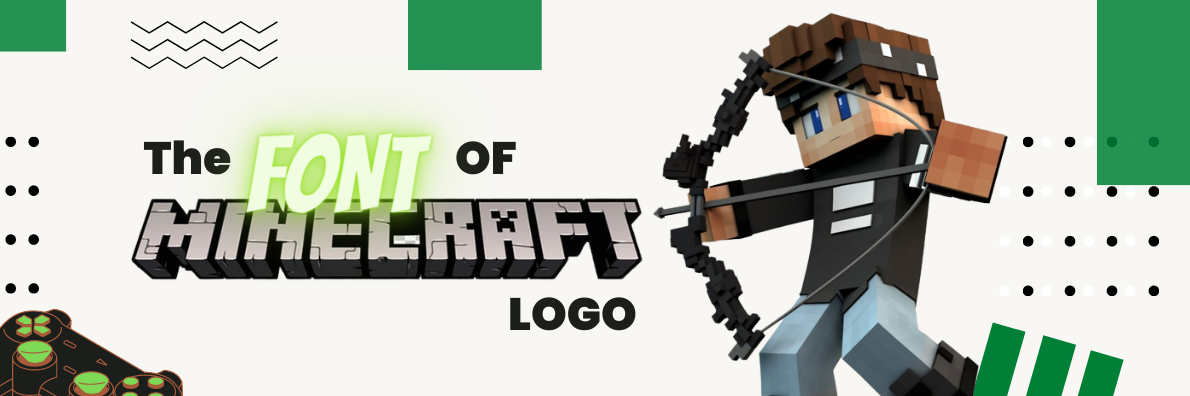
What Font Does The Minecraft Logo Services Include?
The logo font was created from the scratch by the Madpixel Design Company using Minecraft logo design services. You may find some generators creating similar fonts for entertainment purposes. However, there are not really similar fonts online for public use.
The Minecrafter is a unique typeface that uses a combination of geometric angles and textures in order to convey the experience of the Minecraft game. There is a face shape obvious within the “A” of Minecraft, which represents the face of a well-known creature from the game.
The Minecrafter, a distinctive typeface crafted specifically for Minecraft, captures the essence of the game through its blend of geometric angles and textured elements. Expertly designed using catalog design services, this unique typeface adds depth and authenticity to promotional materials, showcasing the immersive experience that Minecraft offers to its players.
This logo features many sharp angles, no serifs, and a three-dimensional appeal which helps to highlight the game’s nature. This wordmark seems to be designed to look more like an image than a standard logotype.
There is also a specific font type within the game called Stgotic, which was designed for low-resolution screen devices and enables the chat functions today. It is also one used to provide players with alerts and information.
Minecraft Gaming Logo Color
The Minecraft logo, is meticulously crafted by Hayden Scott-Baron, incorporates various shades of grey throughout the wordmark, creating a visually striking sense of depth and dimension. The could have hired a professional logo design service provider for the job.
Grey has always been the central shade of the Minecraft emblem, maintaining its significance even in its original form. In addition to grey, the logo prominently features black as another primary color.
For specific requirements such as press releases, a white and black version of the logo is also available, ensuring versatility and consistency in brand representation.
Celebrating The Minecraft Logo
Today, the Minecraft emblem, show how the best branding services can help brands in long term, stands as an absolute champion of the gaming world. It is nearly impossible to find anyone with an interest in computer games who is not familiar with the iconic blocky yet remarkably effective design of the Minecraft wordmark.
Although the previous versions of this logo might have seemed a little simple, they quickly gave way to a highly refined and appealing design. The current Minecraft logo is an amazing, stylized wordmark, available in two versions depending on your needs.
The most common version of this logo is smooth and clean. While the second option features cracks across the three-dimensional letters.
As we know this logo today, it is also present in a host of other games, including the console version of the title and the “Story Mode” game.
